Narodowy Instytut Konserwacji Zabytków (NIKZ) — Poland's National Institute for Monument Conservation — for techlabee.ai, Vilnius.
My role
UX research
Information architecture
UI design
Usability testing
Prototyping
Design system
Team & setup
Fully remote. UX/UI expertise inside a distributed European team — a product owner and developers spread across several countries.
Scope
A native mobile app: onboarding, account, map-based exploration of monuments and historical figures, community contributions, plus brand and design system.
Summary
Designed a map-based heritage guide end to end — from research and architecture to a bold visual identity, a working animated prototype and a documented design system.
Project summary
MonumentApp is a mobile guide to Poland's cultural heritage, made for the Narodowy Instytut Konserwacji Zabytków (NIKZ — the National Institute for Monument Conservation) together with the Vilnius technology studio techlabee.ai. It turns the country's monuments and the historical figures behind them into something you can explore on a map, learn about, navigate to, and help keep up to date.
The idea is a heritage guide that is also a living, community-built dataset: people discover famous locations around them, read about the figures connected to each spot, and can suggest new places when they find a sculpture or monument that isn't on the map yet.
UX researchInformation architectureUI designUsability testingPrototypingDesign system
A fully-remote, distributed team
The project ran entirely remotely. I came in as the UX/UI expertise in a small, cross-border team: a product owner steering priorities and developers spread across several European countries. That setup shaped how I worked — designs had to be unambiguous, the information architecture legible to people in different time zones, and every screen documented well enough to be built without me sitting next to the engineer.
So alongside the interface I invested in the connective tissue: a clear architecture, a shared design system, and a clickable, animated prototype that let the whole team see and agree on the experience before it was coded.
Research & concept
I started with the question underneath the brief: how do people actually want to meet a monument? Research pointed away from a dry catalogue and toward discovery in context — being out in a city and seeing what's around you, who made it, and why it matters. That framed two intertwined objects the whole product would revolve around: monuments (places) and figures (the people behind them), each linked to the other.
It also surfaced a second audience: contributors. Keeping a national heritage map current is impossible top-down, so the concept made every user a potential editor — "you are part of this" — with contribution and credit built into the flows rather than bolted on.
Onboarding & information architecture
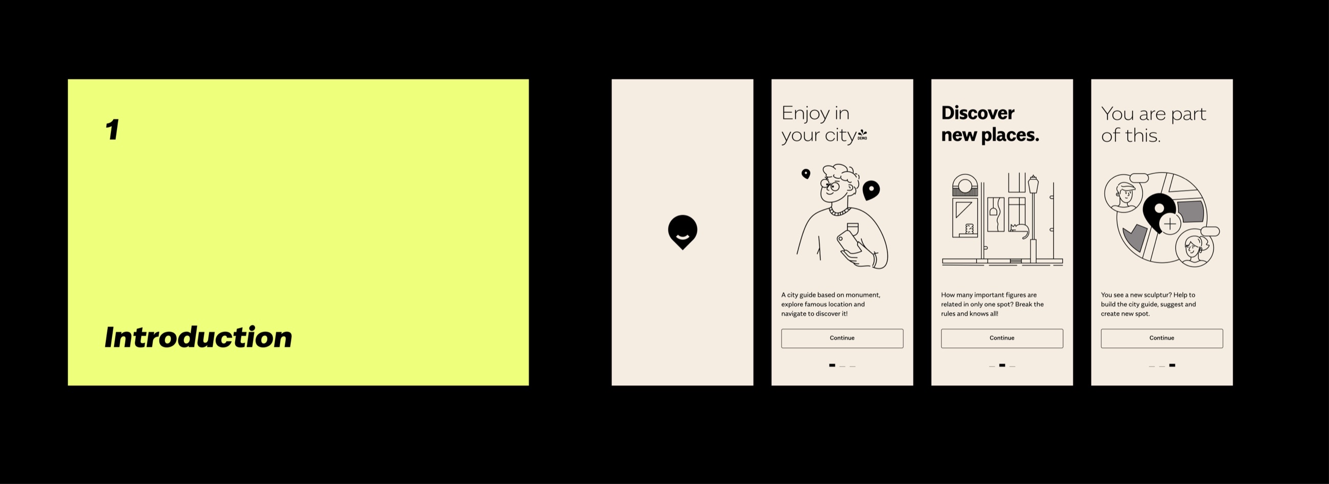
I structured the app around a small, legible set of destinations — Trips, Explore, Favourites and Profile — with the monument/figure duality running through it. The onboarding does one job well: it explains the promise (enjoy your city, discover new places, become a contributor) in three quick, illustrated steps, then gets out of the way.
Onboarding — the concept explained in three illustrated steps.
The core experience: explore monuments & figures
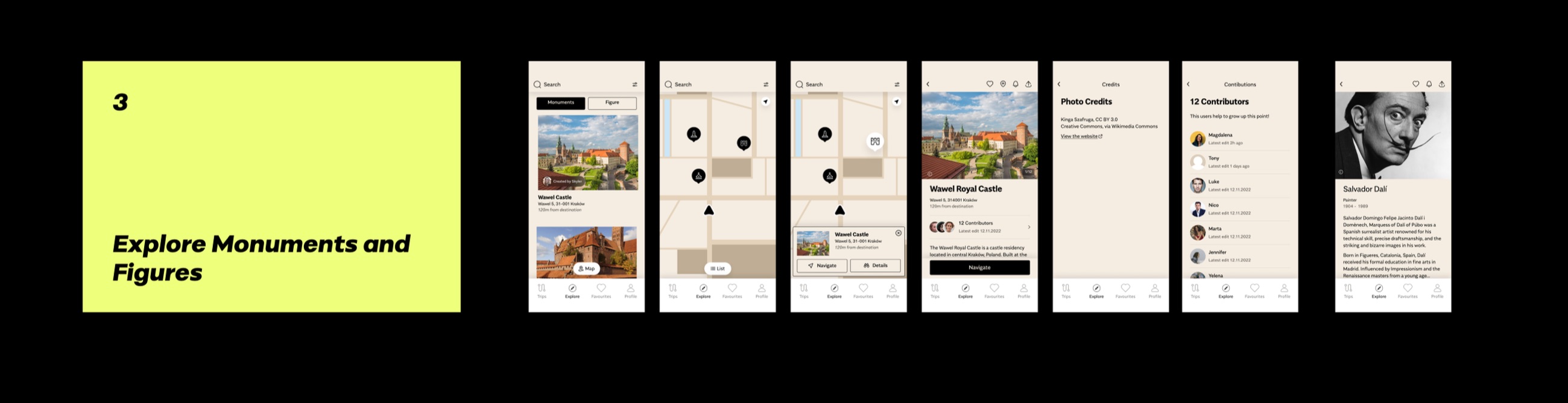
The heart of the app is exploration. Users switch between a list and a map of monuments, open a place to see its photos, address, distance and the historical figures tied to it, and navigate straight there. Each entry credits its contributors and photo sources, making the community effort visible and the data trustworthy. Filtering by period and by related figure lets people follow a thread through history rather than just browse a list.
Account & authentication
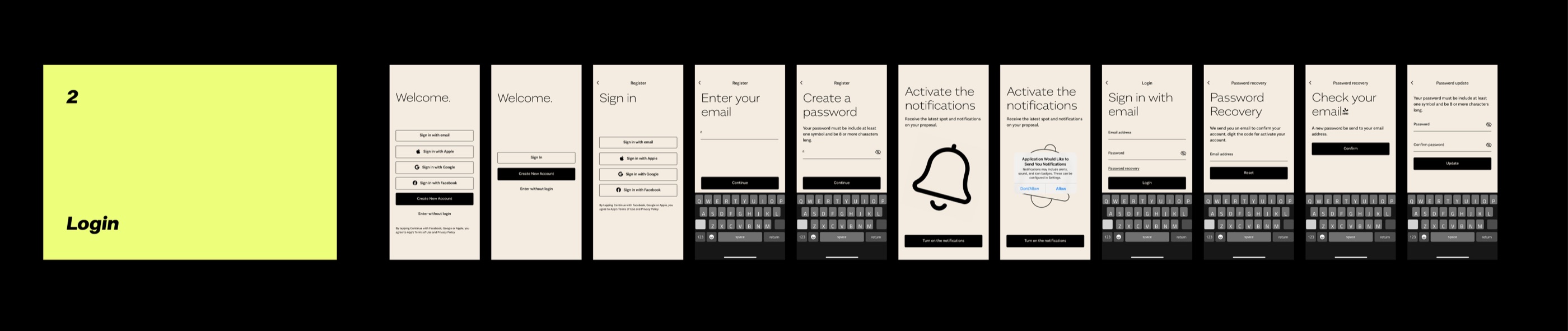
Because contribution needs identity, I designed the full account surface — sign-in options, registration, password creation and recovery, notification opt-in — with a light-touch "explore without login" path so newcomers can look around before committing. Every flow keeps to one clear question per screen and a consistent, calm layout.
The account and authentication flows, end to end.
Brand & app identity
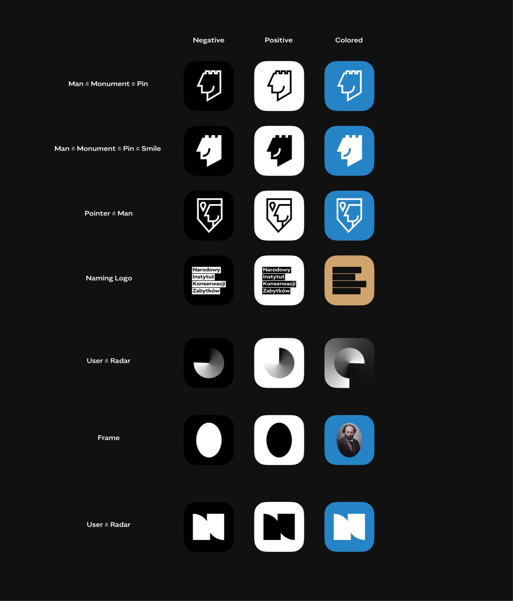
Heritage tends to be dressed in beige nostalgia. I pushed the other way: a confident, contemporary identity in black, chartreuse and cream, set in the wide, characterful Alergia typeface, so the app feels like a cultural product people in their twenties would actually open. I explored the app icon and logo through a single idea — a mark that reads at once as a man, a monument and a map pin — and worked through negative, positive and coloured variants before landing the system.
App-icon and logo exploration — the "man / monument / pin" mark in negative, positive and coloured variants.
Design system
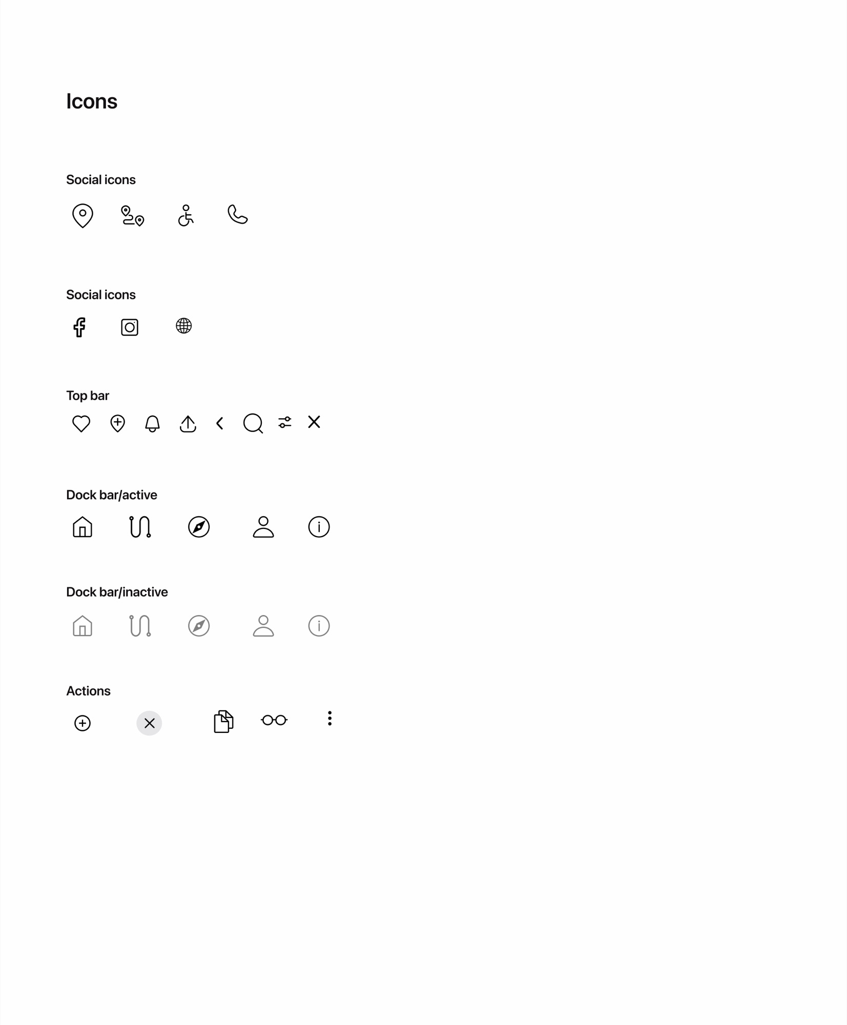
To make the app buildable by a distributed team, I documented a design system: a full type scale in Alergia, a custom icon set (location, routes, accessibility, navigation and dock states), spacing and photo-sizing rules, and reusable components with active and inactive states. It gave the developers a single, unambiguous source of truth — and kept every screen consistent as the app grew.
Part of the icon system — social, top-bar, dock-bar (active/inactive) and action icons.
Prototyping & motion
To align a remote team and test with real users, I built a clickable, animated prototype in Figma — not just static screens, but the transitions and micro-interactions that make the experience feel alive. It let everyone, from the product owner to the developers, experience the flows before a line of code was written, and gave usability sessions something real to react to.
The animated prototype — transitions and micro-interactions, straight from Figma.
Usability testing
I validated the design with users on the working prototype, watching where the monument/figure model clicked and where labels or navigation tripped people up. Each finding fed a concrete change — clearer terminology, tightened flows, better on-screen guidance — so the version handed to development was one already shaped by real behaviour, not assumptions.
The result
A complete, buildable product design for a national heritage app: a research-led concept, a legible architecture, a bold and distinctive identity, an animated prototype validated with users, and a documented design system that let a fully-remote, distributed team turn the designs into a real app.